


EXISTING PROBLEMS AND DESIGN SOLUTIONS
Consistency Level
The website lacked consistency in its content across different pages and in its overall visual identity, including colors, fonts, and graphic designs.
Consistency Optimization
Implementation of a design system throughout the site, defining consistent graphics, and removing text repetitions to avoid overwhelming the reader.
UX Unadapted to Personas
The UX wasn't tailored for an audience including individuals not tech-savvy. Complex vocabulary and lack of information for a business-oriented audience.
UX Optimization
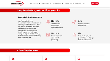
Improvement of infographics, addition of essential information, and rewriting of texts based on insights from user interviews to better answer users' paint points.
Information Level
The information provided was generally disorganized. The user flow wasn't clear, making it difficult to navigate through the site map.
Hierarchy Optimization
Reorganizing key information, creating additional pages to complement existing ones, and adding informational sections based on users' needs.
The Home Page
BEFORE


The homepage hero lacks visual appeal and fails to stand out from the overall website.
The previous design did not effectively convey sufficient information about each section.
The layout was overly repetitive, lengthy, and required excessive user engagement, particularly with early form filling.
AFTER


Implement a cohesive and engaging visual identity that aligns with the graphics used throughout the website.
Develop a tab widget to display additional products and incorporate more detailed information for each section.
Redesign the CTA for a more engaging experience, using concise text and providing clearer transparency about the suggested actions.
Product Pages
ORACLE AUTOMATION - RPA PAGE
Changes implemented
-
Better consistency within the pages
-
Added shorter business-oriented to make sure the content is accessible for all types of users.
ORACLE MOBILITY PAGE
Changes implemented
-
Maintaining a similar layout for consistency across the website.
-
For this page, we merged three pages from the old site that duplicated each other's content. This aims to prevent users from feeling overwhelmed by the excessive amount of information present on the previous website.