

EXISTING PROBLEMS AND DESIGN SOLUTIONS
Inexistant UI Design
Craigslist's website is recognized for its lack of visual elements, making the platform visually unappealing.
User Interface Optimized
Comm'Unity maintains a strong
visual identity consistently displayed across the website.
Complex User Flow
Usability testing conducted during the research process found Craigslist's interface challenging to use.
User Flow Optimized
Comm'Unity provides a smoother flow for completing simple tasks, adapted to a diverse audience of varying ages and technological proficiency.
Information Overload
Craigslist presented an excessive amount of information, overwhelming users during site navigation.
Information Optimization
Comm'Unity focuses on displaying only the most frequently used categories and guiding users with straightforward language for simple actions.
The Wireframes
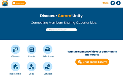
THE HOME PAGE
-
Very simple design complemented by a friendly tone of writing.
-
This single page provides all available actions on the website for enhanced convenience.

POST LISTS
-
Reduced the amount of categories for a less overwhelming user experience.
-
Ability to easily filter / sort by the different posts.
-
Consistent Layout among the different categories for a smoother overall design.


POST DETAILS
-
Created a sidebar to easily navigate between the platforms
-
Implemented a clearer overview of each post to enhance information delivery.
-
Consistent Layout among the different posts for a smoother overall design.


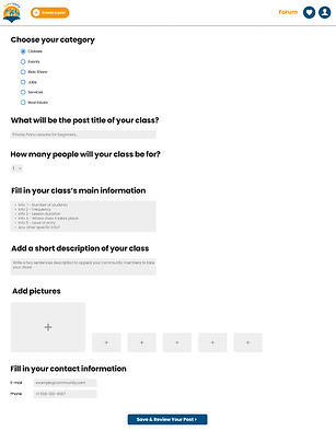
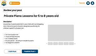
CREATE A POST
-
Created a short and easy User Journey.
-
Provided users the option to review their post before publishing.
-
Provided users with confirmation that their post has been successfully published.

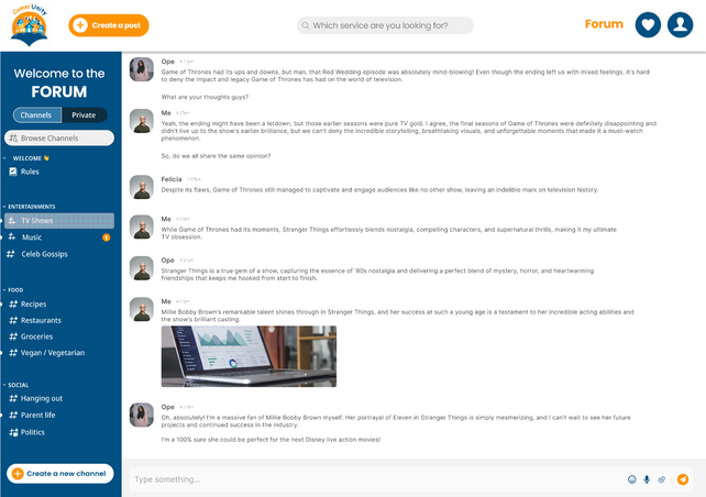
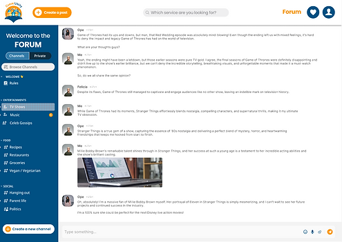
THE FORUM
-
Incorporated this feature to meet users' desire for a community hub to share tips and thoughts collectively.
-
Organized the Channels of Discussion for easier navigation and finding conversations.