


EXISTING PROBLEMS AND DESIGN SOLUTIONS
Users' needs
Users needed a platform to plan in advance on which gas stations they will stop during their road trips.
Users' needs answered
Fuel'Up offers a desktop platform to pre-select the ideal gas station, informed by insights from our interviews and user expectations.
Two different uses
Users expressed two distinct preferences for using the platform: for long versus short drives.
Two different platforms
Fuel'Up provides a double solution: a desktop interface for long trips and a mobile one for daily drives.
Needed for Visual Interface
Users complained most of gas station information found of the web are mostly based on text and difficult to read.
UI Implemented
Fuel'Up incorporated graphic icons and a colorful interface for a visually appealing experience.
Desktop Wireframes
FIRST SCREEN
-
Minimalistic design focuses the user on the primary call to action: entering the destination.
-
Possibility for the user to Log in to his account to overview his/her saved gas stations.

PLANNING A TRIP - ADDING STOPS LAYOUT
-
Layout displays the map alongside the list of gas stations for visual convenience.
-
Implemented actions aligning with users' needs to sort gas stations (by rating, price, amenities filters, etc.).
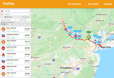

GAS STATION DETAILS
-
Created a sidebar to easily navigate between the gas stations
-
Designed a set of icons for amenities, reviews, location, etc., enhancing the User Interface.


Mobile Wireframes
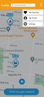
FIRST SCREEN
-
Automatically opens the map for a better understand of the user's real-time location.
-
Reduced on-screen information for enhanced daily usability while driving.
-
Easy access to Favorite Gas Stations eliminates the need for users to manually enter their preferred stations.


GAS STATIONS LIST
-
Consistency between both interfaces to enhance the application visual identity.
-
Implemented actions aligning with users' needs to sort gas stations (by distance, price, amenities filters, etc.).

GAS STATION'S INFORMATION
-
Icons Consistency between Desktop & Mobile interfaces.
-
Enhancing the main Call to Action to Go to this gas station.


DRIVING TO THE GAS STATION LAYOUT
-
Minimal on-screen information to avoid overwhelming the driving user.
-
Upon completing the drive, two call-to-action options appear to encourage the user to stay on the platform.


